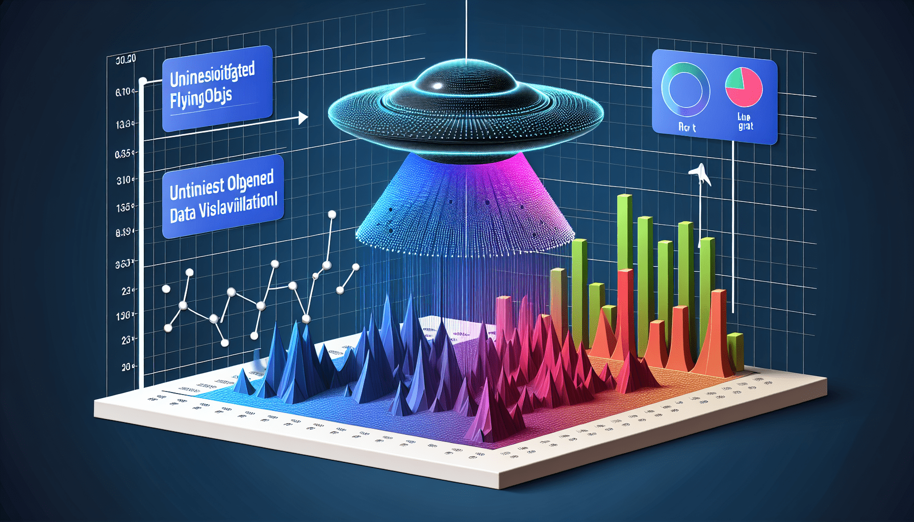
In this article, you will discover the top techniques for UFO data visualization. Have you ever wondered how experts display and analyze UFO data in a visually captivating way? Well, look no further! From interactive maps to dynamic charts, these techniques will take your understanding of UFO sightings to a whole new level. Get ready to explore the fascinating world of UFO data visualization and unlock the secrets hidden within the numbers.
Choosing the right data visualization technique
When it comes to visualizing UFO data, it is crucial to choose the right technique that effectively communicates the insights hidden within the data. To do this, it is important to first understand the data itself. By analyzing the various attributes and characteristics of the data, you can gain a deeper understanding of its structure and relationships. This knowledge will help guide you in selecting the most appropriate visualization techniques.
In addition to understanding the data, it is equally important to identify the purpose of visualization. Are you trying to uncover patterns or trends in UFO sightings? Are you looking to compare UFO sightings across different regions or time periods? Understanding the specific goals of your visualization will allow you to choose techniques that best support these objectives.
Furthermore, considering the audience is essential when selecting visualization techniques. Different visualizations resonate with different people, so it is important to tailor your choices to meet the preferences and needs of your target audience. For example, if you are presenting to a group of analysts, you may opt for more advanced techniques, whereas if you are sharing the visualizations with a general audience, simpler and more intuitive techniques may be more effective.
Lastly, exploring various visualization options is key to finding the best fit for your UFO data. There are numerous visualization techniques available, each with its own strengths and limitations. By experimenting with different techniques, you can find the ones that best showcase the patterns and insights within your UFO data. This exploration phase is crucial for ensuring that your visualizations effectively communicate the intended message.
Creating effective charts and graphs
One popular technique for visualizing UFO data is the use of scatter plots. Scatter plots allow you to map UFO sightings based on their geographical coordinates. By plotting each sighting as a point on the chart, you can easily identify clusters or hotspots of UFO activity. This technique is particularly useful for understanding the spatial distribution of UFO sightings and identifying geographic patterns.
Another effective chart type for comparing UFO sightings is the bar chart. Bar charts allow you to compare the number of UFO sightings across different regions or categories. By representing each region or category as a bar on the chart, you can quickly see which areas have the highest number of sightings. This technique is useful for identifying regions with the most UFO activity or comparing the prevalence of sightings across different demographic groups.
Line graphs are particularly useful when visualizing UFO sightings over time. By plotting the number of sightings on the y-axis and the corresponding time periods on the x-axis, you can easily track the trend of UFO activity over time. This technique is especially valuable for identifying seasonal patterns or long-term trends in UFO sightings. Line graphs also allow for easy comparison between different time periods, such as before and after significant events or policy changes.
Utilizing heat maps and geographic visualizations
Heat maps are a powerful visualization technique for highlighting UFO hotspots. By assigning colors to different intensity levels of UFO sightings, you can create a visually striking map that shows areas with the highest concentration of sightings. This technique allows for quick identification of regions or cities with the most UFO activity, making it an excellent choice for presenting spatial patterns in a compelling way.
Choropleth maps are another effective visualization technique for understanding UFO sightings by state or region. By coloring each state or region based on the number of sightings, you can easily compare the prevalence of UFO activity across different areas. This technique is particularly useful for identifying geographic variations in UFO sightings and understanding how they correlate with demographic or environmental factors.
Geographic visualizations, such as maps and satellite imagery, can provide valuable insights into global UFO patterns. By visualizing UFO sightings on a global scale, you can identify hotspots or trends that span across different countries and continents. This technique is not only visually engaging but also allows for the exploration of UFO activity on a larger scale, uncovering patterns that may not be apparent at a regional or national level.
Harnessing interactive visualization tools
To take your UFO data visualizations to the next level, it is worth exploring interactive visualization tools. These tools allow users to interact with the data, providing a more immersive and engaging experience. With interactive visualizations, you can empower users to explore the data themselves, uncovering insights that may have gone unnoticed in static visualizations.
Tools like Tableau and D3.js are particularly popular for creating interactive data visualizations. Tableau offers a user-friendly interface, making it easy to create dynamic visualizations without extensive programming knowledge. D3.js, on the other hand, is a powerful JavaScript library that provides extensive options for customization and interactivity. Both tools offer a wide range of features and capabilities to enhance your UFO data visualizations.
In addition to creating interactive visualizations, you can also create interactive dashboards for more in-depth UFO analysis. Dashboards allow users to view multiple visualizations simultaneously, providing a holistic view of the data. By linking different visualizations together and enabling filtering or drilling-down capabilities, dashboards enable users to explore the data from different angles and gain deeper insights.
Leveraging advanced data visualization techniques
For those looking to delve even deeper into UFO data analysis, advanced data visualization techniques can provide valuable insights. One such technique is the application of machine learning algorithms for anomaly detection. By training machine learning models on historical UFO data, you can identify anomalous patterns or events that deviate from the norm. These anomalies can be visualized using techniques such as scatter plots or heat maps, helping to shed light on unusual UFO sightings.
Network graphs are another powerful technique for analyzing UFO sighting connections. By visualizing the relationships between different sightings or individuals involved in UFO incidents, you can uncover hidden patterns or networks. Network graphs allow for the identification of clusters or groups within the UFO community, providing insights into how information or sightings are shared and propagated.
Incorporating 3D visualizations can also enhance the depth and perspective of UFO data. 3D visualizations allow for a more immersive exploration of the data, enabling users to view UFO sightings from different angles and perspectives. By adding depth and dimension to the visualizations, 3D techniques can provide a more realistic representation of UFO sightings, enhancing the overall understanding of the data.
Optimizing accessibility of UFO data visualizations
To ensure that your UFO data visualizations are accessible to all users, it is important to consider accessibility factors during the design process. One important consideration is the use of colorblind-friendly palettes. Colorblind individuals may have difficulty distinguishing certain colors, so it is important to choose colors that are easily distinguishable for all users. Additionally, providing alternative textual representations for visualizations, such as providing descriptions or captions, can help users with visual impairments understand the content.
Accessible design elements, such as clear and legible fonts, can also enhance the accessibility of your visualizations. Fonts should be easy to read, with appropriate font sizes and styles that enhance readability. Providing meaningful labels and context is another important aspect of ensuring accessibility. Labels should clearly communicate the information being conveyed in the visualizations, and additional context or annotations can help users understand the significance of the data.
Best practices for UFO data visualization
To create effective UFO data visualizations, it is important to follow best practices that enhance comprehension and engagement. One key practice is simplifying complex data for easy comprehension. UFO data can be complex and multidimensional, so it is important to distill the information into clear and concise visual representations that can be easily understood by the audience.
Choosing appropriate color schemes and fonts is also crucial. Color schemes should be selected based on the message you want to convey and the emotional impact you want to create. Fonts should be chosen for their readability and suitability to the content being presented. By selecting appropriate colors and fonts, you can enhance the overall aesthetic appeal and legibility of your visualizations.
Providing meaningful labels and context is another important practice. Labels should clearly describe what is being visualized and provide relevant information to help the audience interpret the data. Context, such as annotations or explanations, can help users understand the significance of the data and the insights being presented.
Collaborating and sharing UFO visualizations
Collaboration is a valuable aspect of UFO data visualization. By collaborating with others, you can benefit from different perspectives and expertise, ultimately improving the quality and effectiveness of your visualizations. Collaborative visualization platforms, such as Google Sheets or Microsoft Power BI, allow multiple users to work together on the same visualization project, enabling real-time collaboration and feedback.
Sharing your UFO visualizations is also important for reaching a wider audience and fostering data-driven discussions. Websites and social media platforms provide excellent avenues for sharing visualizations with the public. By sharing your visualizations, you can spark interest and engage with other UFO enthusiasts or researchers, encouraging them to contribute their own insights and perspectives.
Encouraging data-driven discussions and contributions can further enhance the value of your UFO visualizations. By inviting others to analyze and explore the data, you can uncover new patterns or insights that may have been overlooked. This collaborative approach can lead to a richer understanding of UFO phenomena and contribute to the collective knowledge in the field.
Interactive storytelling with UFO data visualizations
UFO data visualizations can be used to create powerful narratives that engage and captivate the audience. By combining visualizations with storytelling techniques, you can create a compelling narrative that guides the audience through the data and highlights key insights. Interactive storytelling techniques, such as animations and transitions, can enhance the narrative by providing a dynamic and immersive experience.
Animations and transitions can be used to reveal patterns or trends in the data, creating a sense of anticipation and discovery. By gradually revealing the data and guiding the audience through different visualizations, you can create a narrative arc that builds intrigue and engagement. These interactive elements can also help users understand the sequence of events or changes over time, making the storytelling experience more impactful.
Incorporating multimedia elements, such as audio or video, can further enrich the storytelling experience. Audio narration or background music can create an emotional connection with the audience and enhance the overall atmosphere. Video clips or interviews with eyewitnesses can provide additional context and personal accounts, bringing the UFO phenomena to life.
Future directions in UFO data visualization
As technology continues to advance, there are exciting possibilities for the future of UFO data visualization. One area of exploration is virtual reality (VR) and augmented reality (AR) visualizations. VR and AR technologies allow users to immerse themselves in the data and explore UFO phenomena in a more interactive and immersive way. By visualizing UFO sightings in a virtual or augmented environment, users can gain a deeper understanding of the data and experience the phenomena in a whole new way.
Integrating real-time data feeds is another promising direction for dynamic visualizations. By incorporating live data feeds into visualizations, you can create dynamic and up-to-date views of UFO activity. Real-time visualizations can provide valuable insights into ongoing UFO phenomena, allowing for immediate analysis and response. This integration of real-time data feeds can enhance the timeliness and relevance of UFO data visualizations.
Advancements in data visualization technologies will also play a significant role in shaping the future of UFO research. From improved graphics rendering capabilities to enhanced interactivity, these advancements will enable more sophisticated and immersive visualizations. As technology continues to evolve, UFO researchers will have access to increasingly powerful tools and techniques for understanding and visualizing the mysteries of the universe.